

Creating Responsive Images using the <picture> Element
May 06, 2016 written by Hiroki Yamada

This article introduces the <picture> element, which is a new element as per the HTML5.1 specification.
HTML5.1 is still a Working Draft at the moment, and is expected to reach W3C Recommendation status in September 2016. However, major Web browsers like Firefox, Google Chrome, Safari, Android Browser and iOS Safari already support the <picture> element. If a majority of your target audience doesn’t use IE, and you do not need to consider support for it on your website, you can start using it!
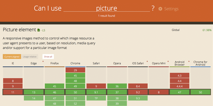
You can check browser compatibility details on the “Can I Use”website.
What is the <picture> element?
You might be familiar with the experience of struggling to deal with optimising images for different screen resolutions when trying to build a responsive site. For example, if you prepared a very high resolution picture to serve as a full-width image on the desktop view of your site, the same image may take a very long to load on mobile devices!
In such cases, we resort to using CSS and JavaScript to change the image according to device size and device orientation (portrait/landscape).
Not any longer! The <picture> element will finally solve this problem!
The HTML5.1 specification of the <picture> element is defined as follows:
The
<picture>element is a container which provides multiples sources to its containedelement to allow authors to declaratively control or give hints to the user agent about which image resource to use, based on the screen pixel density, viewport size, image format, and other factors.
Put simply, the element provides the browser with alternate images to display according to certain factors. These images are defined using the <img> and <source> elements, contained within the <picture> element. Let’s take a look at a sample code snippet!
The <picture> element with media attribute
Before diving into the code, please take a look at how the following image works.
On the latest version of Google Chrome or Firefox, the image should change when you change the size of the browser window, or use the Responsive view in the browser’s code inspector.
Oh, by the way. The characters in the images are Internet Academy’s mascots. 
Okay, let’s look at the source code!
<picture>
<source media="(min-width: 768px)" srcset="images/picture_l.gif">
<source media="(min-width: 321px)" srcset="images/picture_m.gif">
<img src="images/picture_s.gif" alt="IA character">
</picture>
That’s it! No CSS, No JavaScript!
The important part is the media attribute. Just like CSS media queries, you can use this to set the min-width, max-width and so on. In this sample code, the breakpoints are 768px and 321px. So, if you use a usual desktop computer, you will see picture_l.gif because your browser window size might be more than 768px. If you use an iPhone 5s, you will see picture_s.gif.
Similarly, for your website, you just need to set the breakpoint, and prepare images that fit each breakpoint size. Then, the <picture> element will automatically change the image according to your code.
Another important point to note is the order. The <img> element must be written at the end of the <picture> element. This works as fallback inside the <picture> element. So, if the user is using an old browser that doesn’t support the picture element, the browser will display the image in the <img> element.
Please remember, if you write the <source> elements after the <img> element, these <source> elements are ignored by the browser.
Change the image according to pixel density
Currently, the pixel density of display devices are starting to increase – like the Apple Retina display, for example. In the next few years, 4k displays and 8k displays will probably become the norm. So how would we choose images to fit the pixel density of the display device?
You guessed it, the <picture> element can handle this, as well!
<picture>
<source media="(min-width: 768px)" srcset="images/picture_l.gif, images/picture_l_1.5x.gif 1.5x, images/picture_l_2x.gif 2x">
<source media="(min-width: 320px)" srcset="images/picture_m.gif, images/picture_m_1.5x.gif 1.5x, images/picture_m_2x.gif 2x">
<img srcset="images/picture_s.gif, images/picture_s_1.5x.gif 1.5x, images/picture_s_2x.gif 2x" alt="IA Character">
</picture>
You can use the srcset attribute to change the image to suit the pixel density. The srcset attribute can have two or more image resources, where each image resource is split by “,” and a value like “1.5x”, “2x”. “1.5x” describes the pixel density, so if the user is using a 1.5x pixel density display, the browser uses the 1.5x picture.
Okay, so this is your introduction to the <picture> element! I think that the <picture>, <source> and <img> elements will become more powerful and versatile in HTML5.1.
As mentioned before, many of the major browsers already support the <picture> element. So go ahead and try it out!