

How to Make a Simple Gallery Slider with HTML and CSS
April 15, 2016 written by Eric

A common web trend today is the use of an animation slider on a website to promote certain promotional or conceptual images and videos.
These animation sliders, or carousels, are usually placed at the top of a web page and are composed of a gallery of images and videos, which serve to substitute a single static splash image (or hero image).
The screenshot featured above is from Internet Academy’s very own website, and in today’s article, I am going to walk you through how to create a carousel slider for your own website.
Ready? Let’s get started!
Gallery Carousel in a Nutshell
Let me show you a quick outline of the implementation architecture used on our Internet Academy website, optimised for your reference.
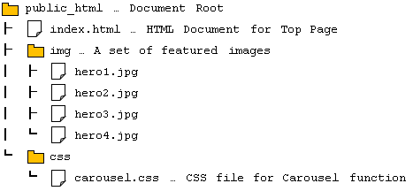
File Location
HTML Code (index.html)
<div id="heroGallery">
<ul id="carousel">
<li><img src="img/hero1.jpg" alt="" width="1300" height="600"></li>
<li><img src="img/hero2.jpg" alt="" width="400" height="600"></li>
<li><img src="img/hero3.jpg" alt="" width="400" height="600"></li>
<li><img src="img/hero4.jpg" alt="" width="800" height="600"></li>
<!-- Duplicate -->
<li><img src="img/hero1.jpg" alt="" width="1300" height="600"></li>
<li><img src="img/hero2.jpg" alt="" width="400" height="600"></li>
<li><img src="img/hero3.jpg" alt="" width="400" height="600"></li>
<li><img src="img/hero4.jpg" alt="" width="800" height="600"></li>
</ul>
</div>
CSS Code (carousel.css)
#heroGallery {
width: 100%;
height: 600px;
overflow: hidden;
}
@keyframes carousel {
from { transform: translate3d(0, 0, 0); }
to { transform: translate3d(-2900px, 0, 0); }
}
#carousel {
width: 5800px;
height: 600px;
transform: translate3d(0,0,0);
animation: carousel 90s linear infinite;
}
#carousel li {
display: block;
float: left;
}
Duplicate Images for Infinite Loop – HTML
Now, I will explain the code in more detail.
<div id="heroGallery">
<ul id="carousel">
<li><img src="img/hero1.jpg" alt="" width="1300" height="600"></li>
<li><img src="img/hero2.jpg" alt="" width="400" height="600"></li>
<li><img src="img/hero3.jpg" alt="" width="400" height="600"></li>
<li><img src="img/hero4.jpg" alt="" width="800" height="600"></li>
<!-- Duplicate -->
<li><img src="img/hero1.jpg" alt="" width="1300" height="600"></li>
<li><img src="img/hero2.jpg" alt="" width="400" height="600"></li>
<li><img src="img/hero3.jpg" alt="" width="400" height="600"></li>
<li><img src="img/hero4.jpg" alt="" width="800" height="600"></li>
</ul>
</div>
First, let us take a look at the structure of the Web page components – handled by, of course, HTML. Roughly speaking, there are three components required for building the gallery carousel shown above. They are (1) a placeholder, (2) a slider box, and (3) images for filling out the slider box.
In the code, we have used <div id=”heroGallery”> as a placeholder which is also the root element of the gallery carousel. The attribute id is set only for the purpose of styling (explained further in the next section). Then we placed <ul id=”carousel”> in it to make a slider component. A slider box should have multiple images in it and usually moves from right to left. Let us place the prepared images in each <li> tag of the slider box.
Is that all? No, actually. Some of you might have noticed that the list of images in the slider has been duplicated so that each image appears twice. Any guesses why?
This is because we are trying to connect the end of the image gallery to the beginning so that it shows a continuous loop of the gallery. The carousel animation now (moving from right to left) will never be split. Connected loop, forever!
CSS Animation for Gallery Carousel
Okay, let us move on to the next step. This is the most important part of this article — how to make a CSS-animated gallery carousel.
#heroGallery {
width: 100%;
height: 600px;
overflow: hidden;
}
This ruleset is applied to the placeholder. The hero area is usually full-width (width: 100%) and has the same height as the contained images (600px in this case). So now, this placeholder box should show only the currently highlighted image and hide the other images which are waiting to be highlighted, or have already passed the highlighted area. That is why the cropping occurs. (overflow: hidden).
#carousel {
width: 5800px;
height: 600px;
}
#carousel li {
display: block;
float: left;
}
Let us now look at the dimensional and layout style rules.
#carousel is nothing but the slider box. This is the only child element of the placeholder. It needs to hold all the main images, as well as the duplicate ones in it. Therefore, its width should be the width of the image array multiplied by two. In this case, (1,300 px + 400 px + 400 px + 800 px) × 2 = 5,800 px should be the width of the slider box.
We also want to align the images horizontally, rather than the <li>’s default layout (vertical), so we did that by the traditional method using display: block and float: left. Every time I use this method, I feel like I’m back in the primitive age though…
@keyframes carousel {
from { transform: translate3d(0, 0, 0); }
to { transform: translate3d(-2900px, 0, 0); }
}
#carousel {
transform: translate3d(0,0,0);
animation: carousel 90s linear infinite;
}
Moving on!
Welcome to the key point of the day. This is the trick of a CSS-driven gallery carousel. Using the @keyframes rule, we can define the starting state and ending state of an animation, as well as the detail of the transition.
We have set the first state of the slider box’s location to (0, 0, 0) *(x, y, z). Then the ending location is set as (-2900px, 0, 0) — which means that all of the original featured images will pass the highlighted area completely. I didn’t want to make the speed of the animation too fast, so the time duration of the animation has been set to 90 seconds (the second argument for the animation property).
The repetition of the animation has also been set as infinite so that once the original images pass the highlighted area, the location of the slider box will be reset to (0, 0, 0). As a result, the original image array will instantly come back to the beginning position and the moving animation will restart once again, very smoothly. Our audience will never realise that there are just two duplicate image galleries moving from right to left repeatedly. It will appear as though we have created a ‘carousel’ of images! 
Here’s a look at our final result.
Please give it a try!