Design Trends in 2016 : Card UI
April 02, 2016 written by Trivikram Rao
One of the recent trends in Web Design is Card UI. This interface is used to make users understand content more easily and visually. Additionally, the card layout can also be easily optimised for different screen sizes.
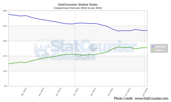
According to statistics from Statcounter from Jan 2014 to Jan 2016 (shown below), the increase in mobile users has made it necessary for designers to compulsorily cater to small screens along with desktop designs.
A solution to easy organisation across various screen devices, is to provide users with content-rich web layouts via the Card UI design.
The cool thing about this is you have probably already seen websites use this before!
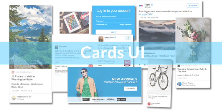
Many websites, from Twitter, Facebook and Jabong to Adidas and Spotify are all built on the Card Design layout.
So. What is a ‘Card’?
It is just a container which showcases information relevant to users of that site, which they can then share, like, comment on, or carry out some other action.
Why should you use Card UI as a Designer?
Let us think about the psychology of this layout for a second.
Are there any cards that you use in your daily life, without paying much attention to them?
Of course you do! All of us are actually really familiar with Card UI already – our driver’s licence, credit cards, membership cards, etc. are all examples of this. Each one is self-sufficient in its own right, and contains all the necessary information in a card format.
So it was only a matter of time before the concept started being applied to Web Design. Which is a good thing for you, as a Designer, since users know how it is supposed to work.
Let’s take a look.
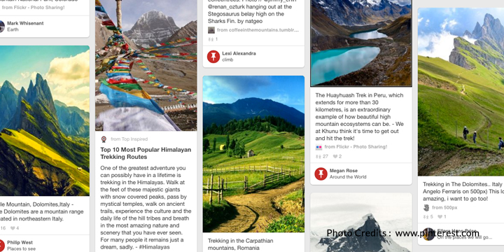
Pinterest was one of the first popular users of the card layout. On visiting the site, users can search for a particular topic or interest, and are shown a feed of related cards – complete with details of who ‘pinned’ the card, which ‘board’ they categorised it under, as well as a brief description about the content of the card. Clicking on any of the cards leads the user to the original website that the ‘pinner’ captured the information from.
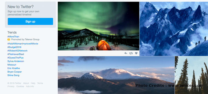
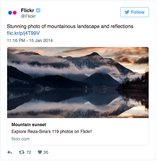
Twitter’s layout was born card-ready, and about a year ago, launched its own product called Twitter Cards [https://dev.twitter.com/cards/overview].
Twitter Cards is an initiative dedicated to allow users to embed rich photos, videos and media experience to Tweets and drive traffic to websites.
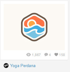
Dribbble
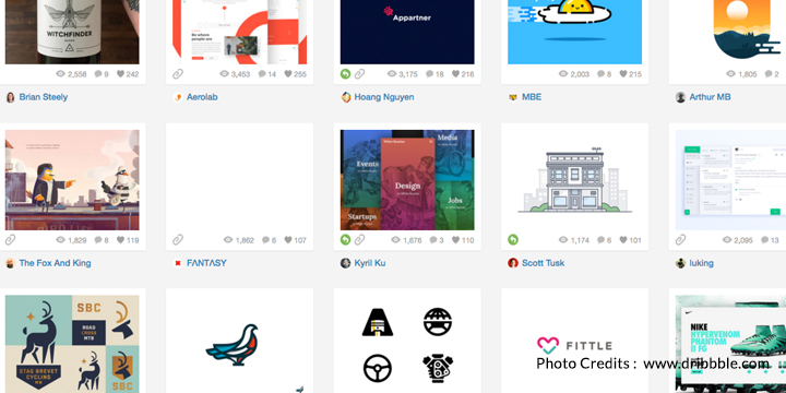
Dribbble is a website dedicated to artists and designers showcasing their work, and working as a community to push the boundaries of what Design can achieve.
Once a Dribbble user publishes their work, it is visible in the relevant category feeds along with information about the creator, and the number of views, ‘likes’ and comments that the work has received. All this information can be gathered in just one glance.
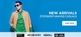
Jabong
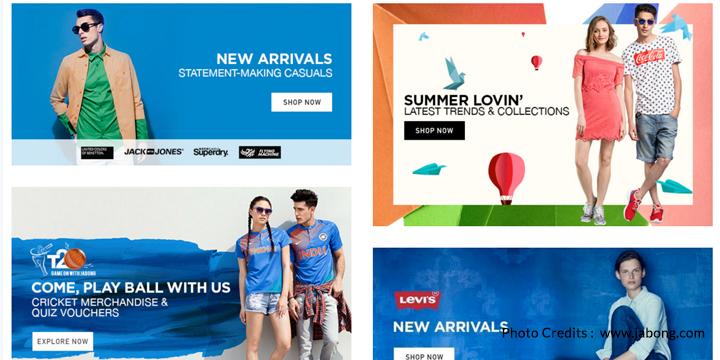
Jabong is an e-commerce website currently based primarily in India (where I’m from) that uses the card layout to create attractive banners for each apparel category. They achieve this by following a simple card format that targets three points – a hero heading text in bold, a featured image with brand names, and a call-to-action button. All the items in each card are carefully chose to harmonise with each other to create a distinct feel to each card.
Using these examples as a base, let us see the different ways you can use this in your work.
1. Content Block
This kind of card focuses largely on the content first (like in Dribbble), with minor additions to it that talk about the value of the content (in terms of views, likes, etc.)
2. Descriptive Content
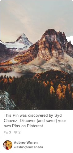
A card can contain an image and some descriptive text that elaborates on the purpose of the image, like commonly seen on Pinterest.
3. Call-to-action
You can also build entire cards around a call-to-action button, like “Sign Up” or “Add to Shopping Cart”.
4. Social Sharing and Entertainment
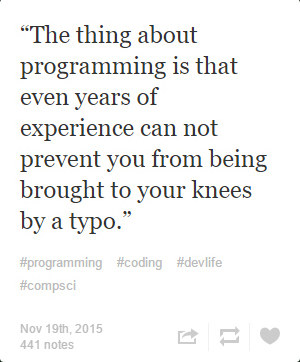
A card can contain ‘shareable’ content created solely for the purpose of reaching a social audience and building connections. We see strong examples of this in Tumblr’s layout.
5. Rich Media
Cards can also contain rich-media (Twitter), or aggregate content from various sources to show users what is most relevant to them at a current point in time (Google Now).
In whatever way you choose to use the Card UI, there is no denying its usefulness and aesthetic appeal. An additional bonus is that is makes responsive web layout much easier to handle since all your content is in neatly wrapped containers!
So go ahead and use this in your next project! I am excited to see what you come up with.
Internet Academy claims no association with the user accounts featured in this article. If one of the accounts or images featured above belongs to you, and you would like to issue a take-down request, please let us know at [email protected].