

Designing for the Responsive Web – using Apple as a Case Study
February 15, 2016 written by Eric
Making your website responsive is simple if you have learned the basics of Responsive Web Design.
It does take a little time, however, for tech beginners to feel satisfied with their final work.
Not to worry! Because today I am going to walk you through what you can do to speed up your learning curve.
There are two steps to achieving this. First, as you might expect, is by continuous practice and improvement. Second, is to do a detailed study of successful cases.
Let us use the Apple Inc. website as an example.
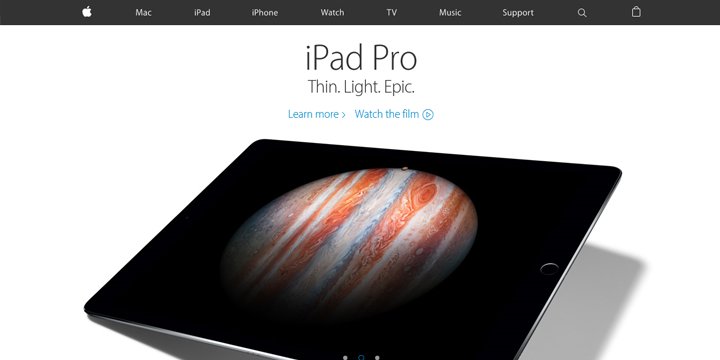
Apple’s Website
http://www.apple.com/
At first glance, your attention might probably be drawn to the big hero image of a product and its description covering almost the entire view on your screen. (Please refer to the above picture)
Immediately after that, you may get interested in the header with the global navigation menu, as the background-color contrast between this and the main area makes it very apparent. (As you might know, the biggest contrast is created by black and white)
Okay, now let us see the mobile view of this above-the-fold area of the website.
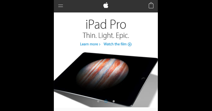
It looks well-optimised on the screen, doesn’t it?
The colouring and contents look the same, and the layout is changed delicately for mobile screen users.
This is Responsive Web Design.
On changing the window size of the Web browser displaying this website on your desktop, some key changes will be observed. Let’s look into them.
Three Major Breakpoints
Most Web Designers first pay attention to the breakpoints of a website. Breakpoints are nothing but a set of screen widths that trigger some changes in the layout.
We can see that several breakpoints have been used on Apple’s website, but let us focus on the following three major breakpoints that are causing the most important changes in the layout.
- Width of 320+ px (Mobile Screens)
- Width of 768+ px (Tablet Screens)
- Width of 1,069+ px (Desktop Screens)
*The unit “px” is based on the CSS Pixel in this article.
In terms of the popular implementation pattern “Mobile First”, the actual designing procedure is shown below:
- Step 1. Make a design for the screen width of 320 px and keep the main area responsive to changes in screen size.
- Step 2. Overwrite the design to adjust to the screen width of 760 px, in which the main area is still responsive.
- Step 3. Then, add the design for the screen width of 1,069 px while keeping the main area’s fixed-width at 980 px.
Regarding the page margin that gives some space at the left and right end of the page,
- – Fixed at 16 px (Mobile Screens)
- – Fixed at 22 px (Tablet Screens)
- – Scalable w/ min. 22 px (Desktop Screens)
This is what Apple implements on the page margin.
Difference in Layout for Each Device
Now, let us look into the details about the elements that will be affected at each major breakpoint.
These are the “Header”, “Number of Columns” and the “Footer”.
Let me explain in detail.
Header Optimisation
It is probably in the header that you found the biggest difference between the mobile version and tablet/desktop versions.
It is now a common design pattern – the global navigation will move into the hamburger menu (parallel-line button in the header) and there will be only three simple icons which appear in the header – the hamburger menu, the Apple icon and a shopping bag!
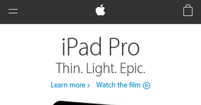
Simple and cool.
Even the transition effect of this hamburger after eating … no, after clicking, is stylish – which is as usual for Apple.
Good Example of an Accordion Menu
You might not notice this component when you are looking at only the top page.
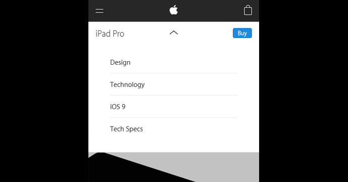
That is an accordion menu (a menu whose items slide-down to reveal more text) which is placed immediately below the header bar.
That component represents a local navigation for a sub-level page in the tablet/desktop screens.
Similarly, you might find another accordion menu in the footer of each page.
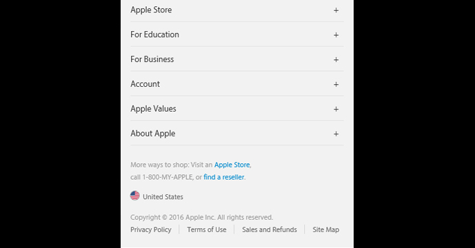
This is called “Directory” (or simply, Footer Menu) which we often see in large-scale websites.
Such a complicated directory structure becomes accessible even in mobile screens once it is converted to an accordion menu.
Number of Columns Affected?
You can find this feature in the layout of the four promos (product promotion banners) located immediately before the footer.
The rule is simple:
- 1 Column (Mobile Screens)
- 2 Columns (Tablet Screens)
- 4 Columns (Desktop Screens)
Their number usually depends on the volume of content in the banners.
We can often see a 3-column layout on desktop screens. (Internet Academy’s website also has 3-column sections in some places.)
There is no industry standard that governs this.
We just need to choose the best pattern to optimise the UX (User Experience) of a page.
Fonts and Buttons
Lastly, let us take a look at the optimisation of each page component’s size.
We have to consider the following two points of view:
One is “Readability of Text” and the other is “Tap-ability of Buttons”.
No doubt, Apple takes these criteria into serious consideration because it is directly related to “Typography”, which is a design field Mr. Steve Jobs frequently mentioned.
So what are the actual settings for fonts and buttons?
Base Size of Fonts (All Screens):
font-size: 18px;
Baseline Distance (All Screens):
line-height: 1.45;
Variation of Font Size:
12 – 48 px (Mobile Screens)
12 – 64 px (Tablet/Desktop Screens)
Min. Size of Clickable Buttons:
48 px (Mobile Screens)
44 px (Tablet/Desktop Screens)
This is the summary.
I hope that it will help you as a reference.
By the way, I ignored all the small buttons which have been put in the footer.
It seems like they haven’t focused as much on the footer buttons, especially from a tap-ability point of view. This doesn’t mean that they aren’t important.
To Wrap Up
Thank you very much for reading until the end.
How was it? Did it help you further learn about RWD?
Deep analysis of excellent work always gives us many findings and insights.
I’m sure that this will be an effective method for studying Web Design.
This approach can be applied not only to Web Design, but also to research about coding style and development processes.
Give it a try with other popular websites.